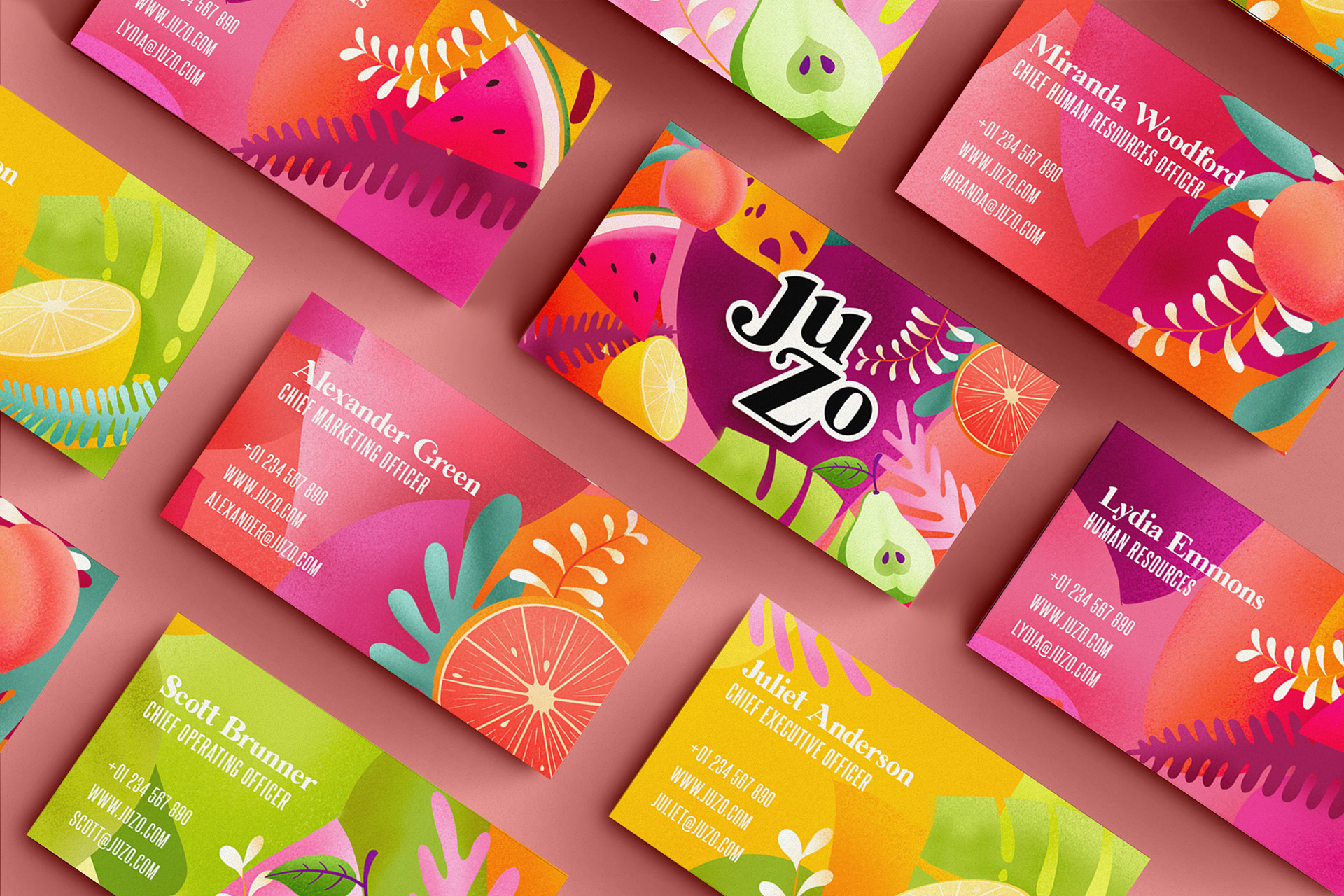
J u Z o - B R A N D I N G - L o g o - P a c k a g i n g D e s i g n
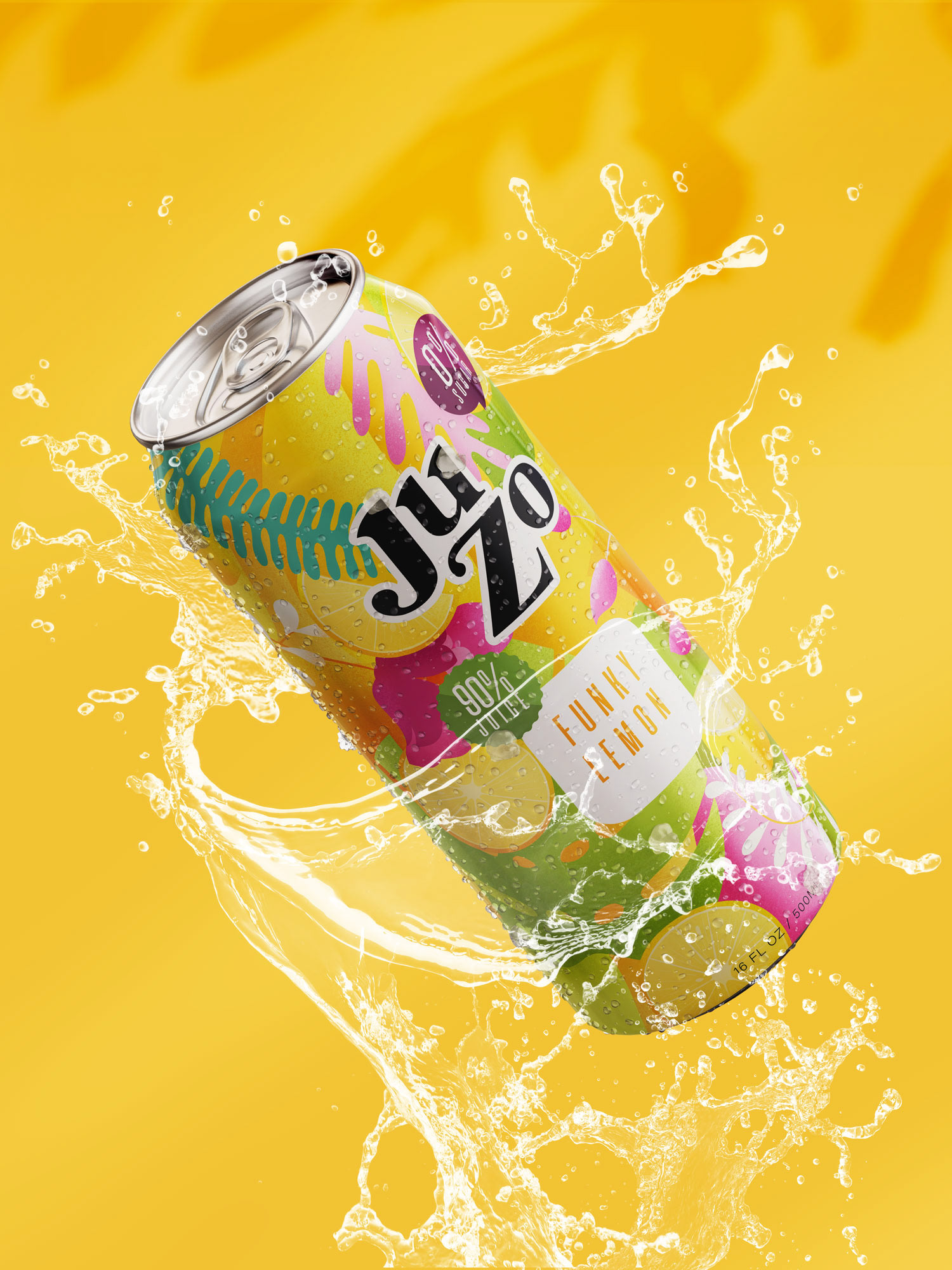
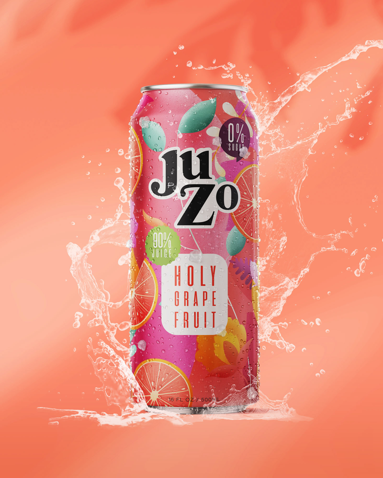
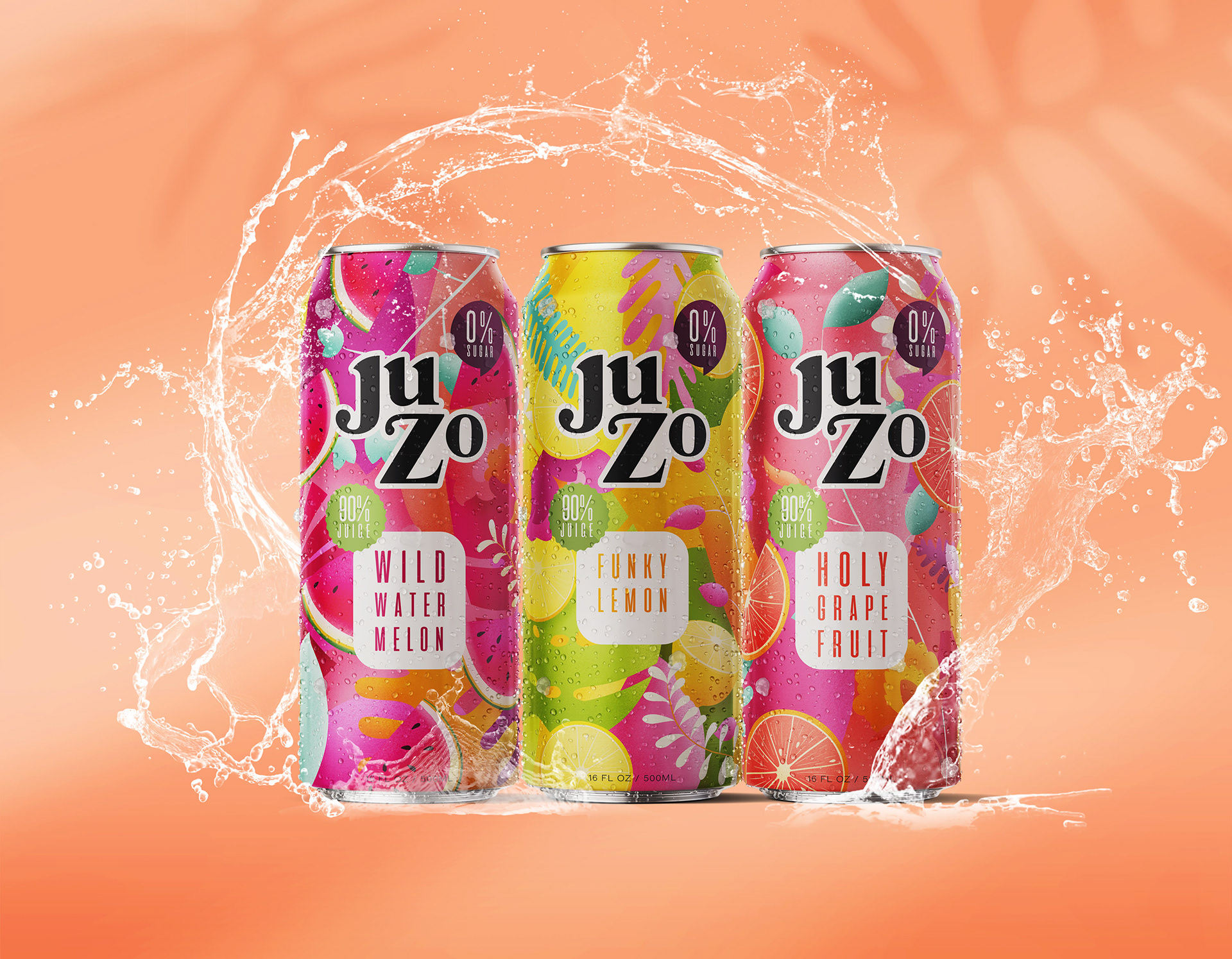
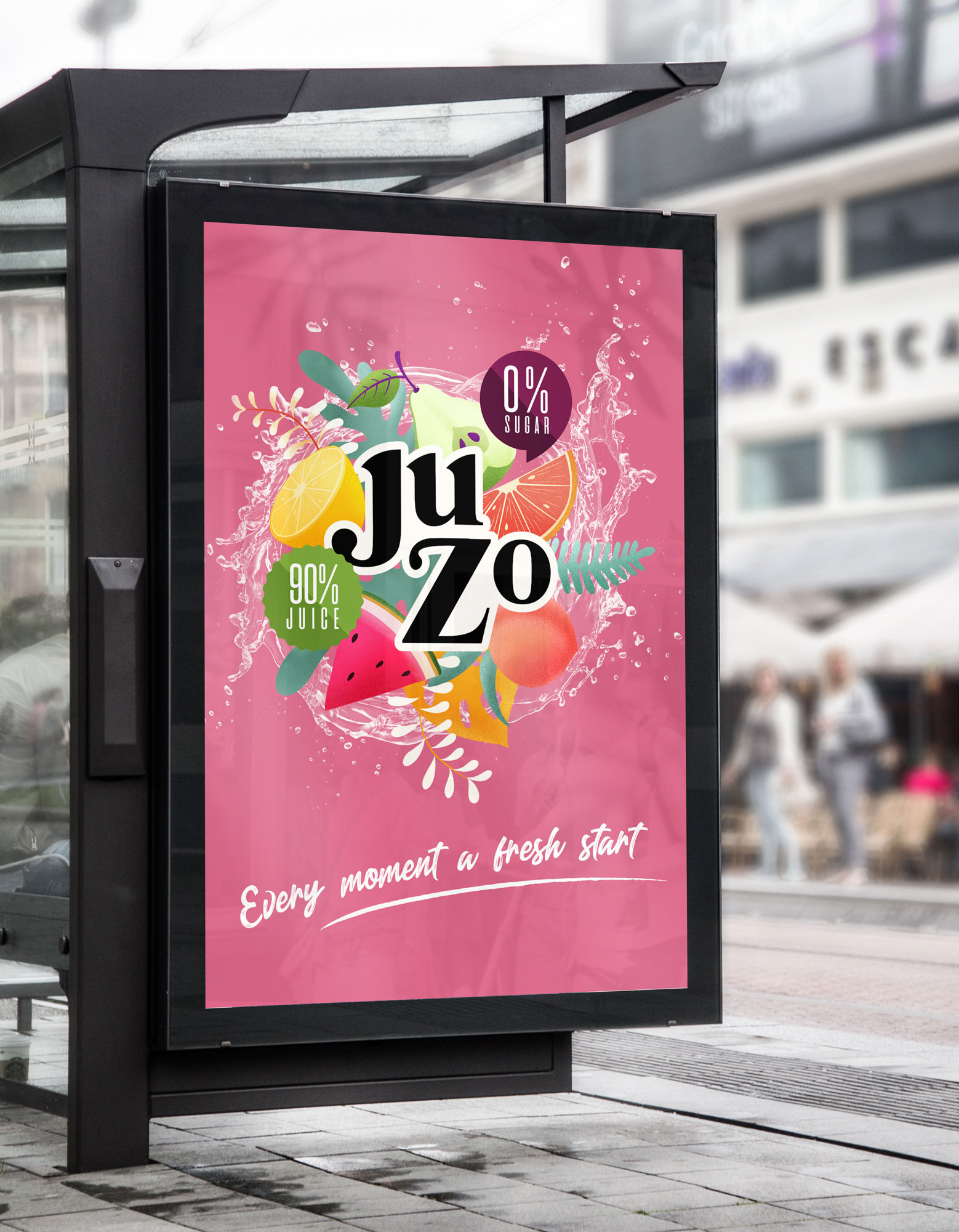
JuZo is personal project for a soft drink without added sugars and flavorings. Their soda contains 90% fruit and only 0% sugar. Their goal is to be known as a trendy brand, with a fresh colorful look.
Thinking Proces
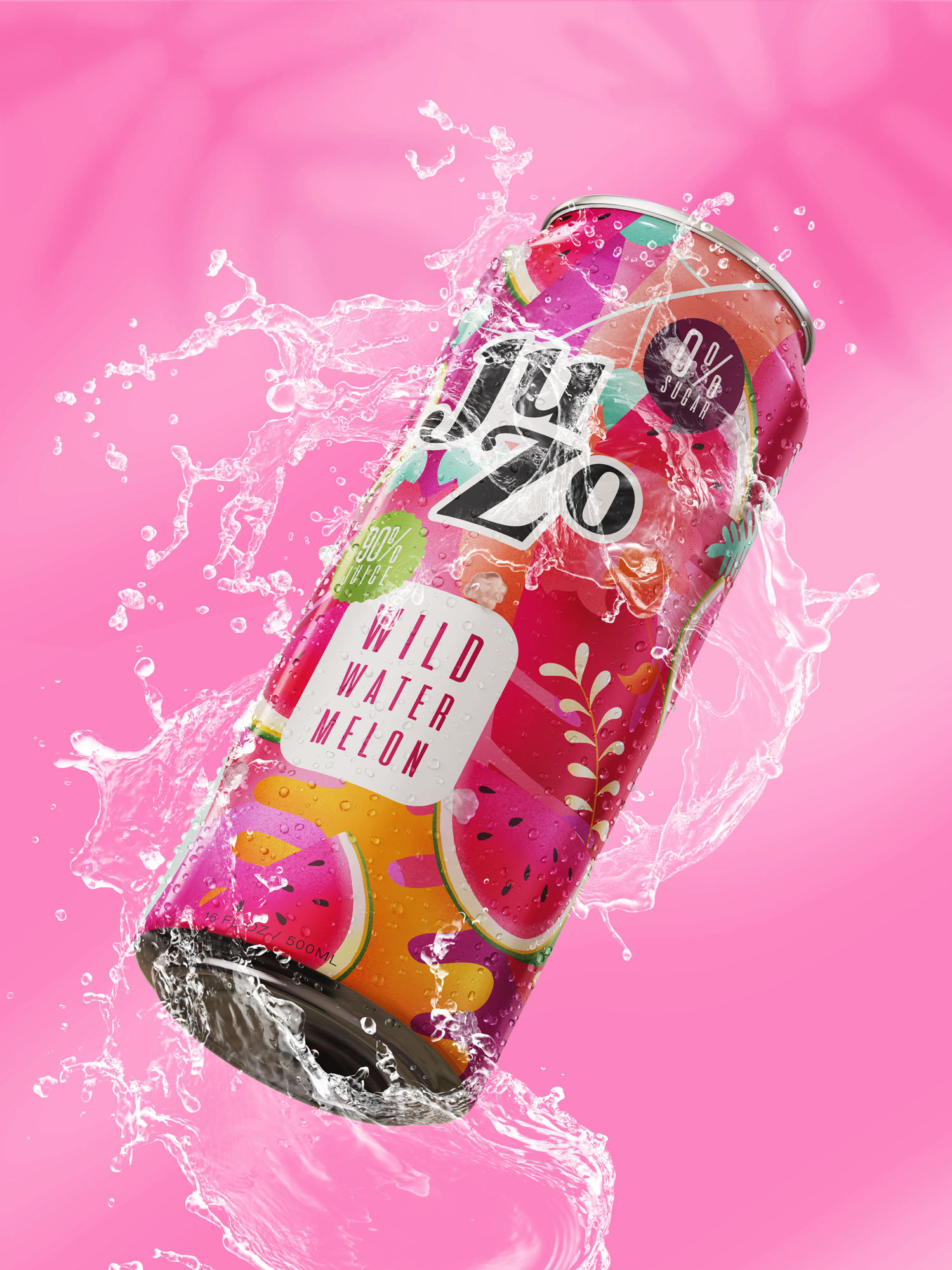
Since JuZo is most seen with their soda cans, the logo should contrast with the colorful cans. That is why we decided to keep the logo black and white.
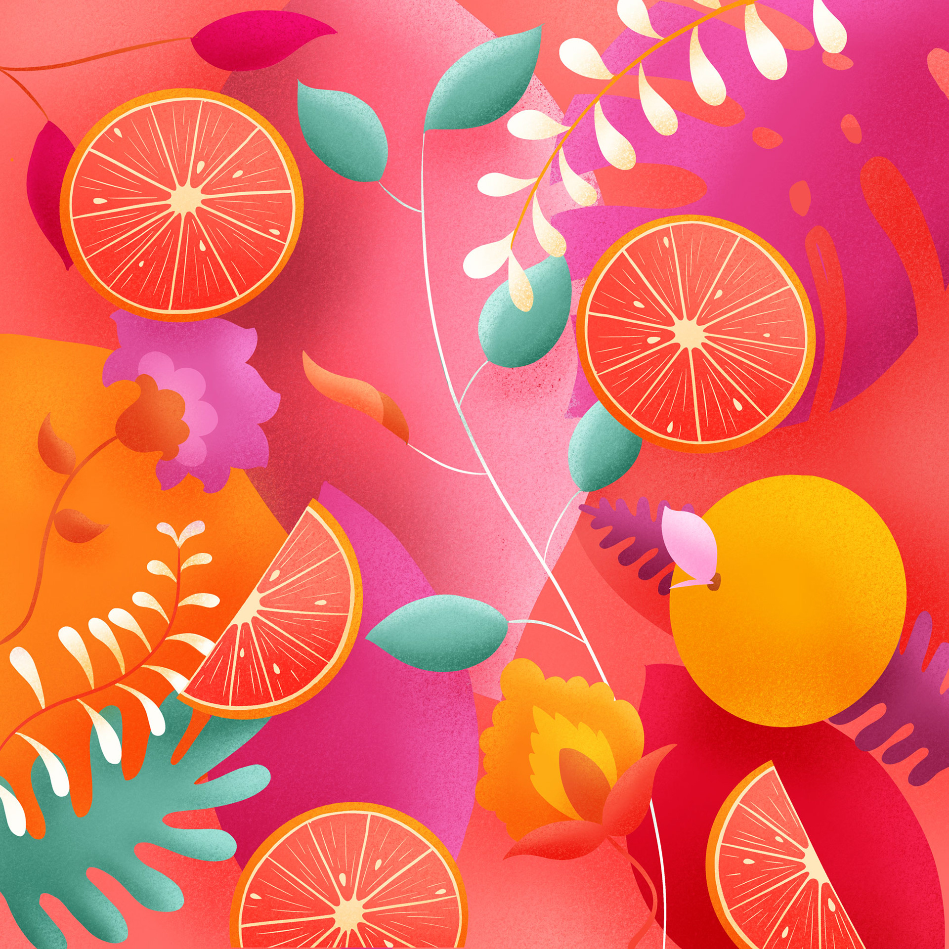
Each can is given a color palette with matching colors, with an occasional contrasting color. The black and white therefore stands out well.
Each can is given a color palette with matching colors, with an occasional contrasting color. The black and white therefore stands out well.
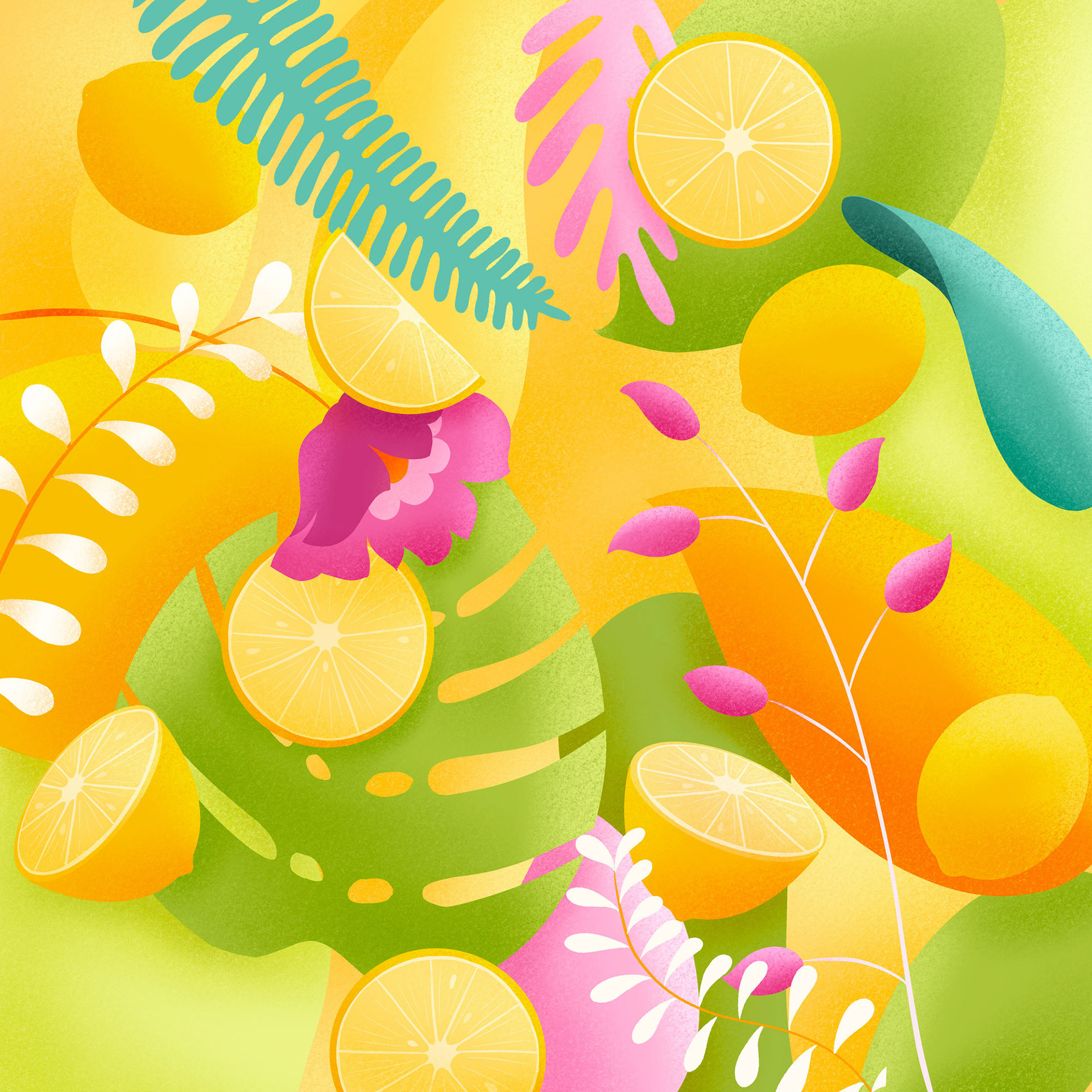
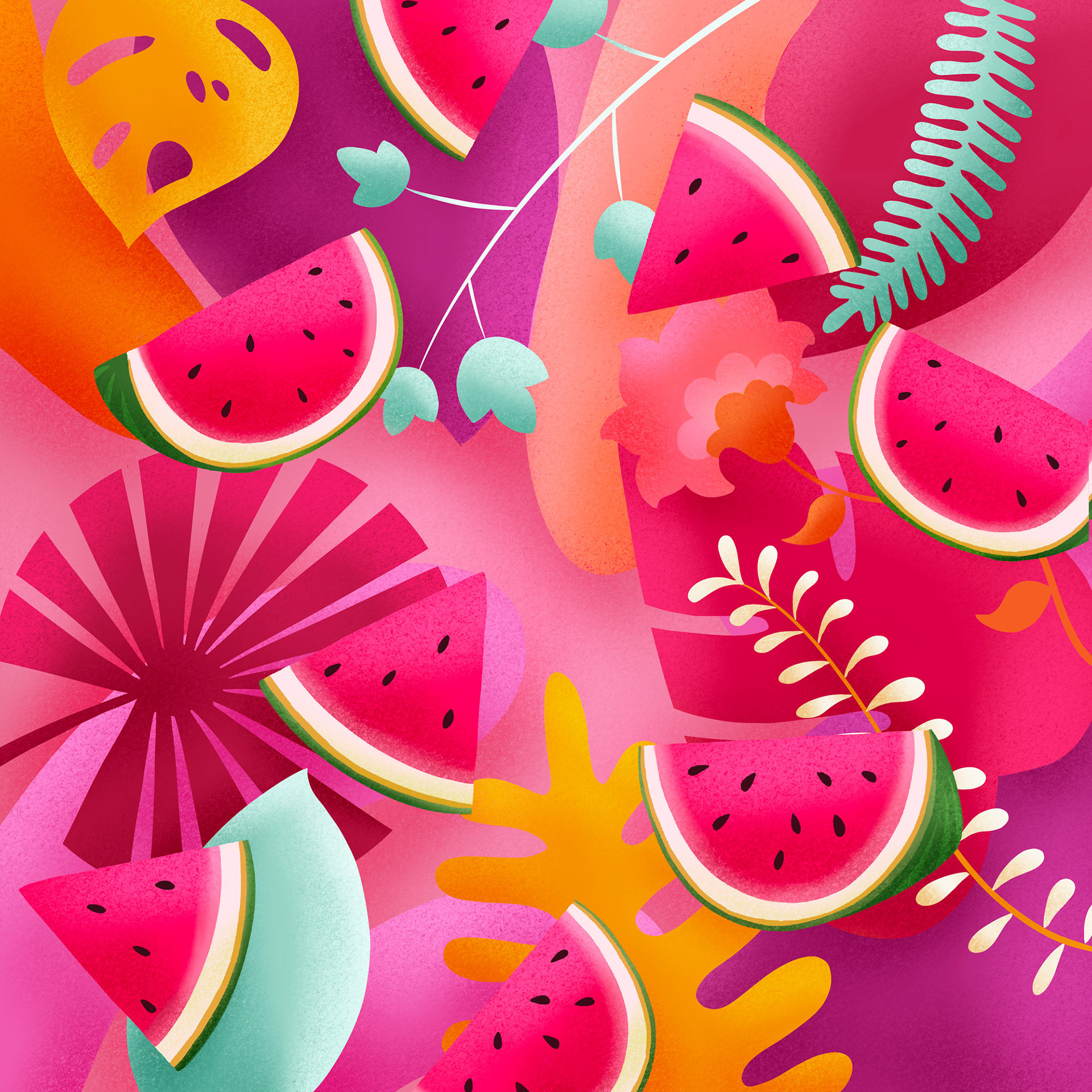
We have chosen to draw the illustrations on an iPad, using the Pro Create program. In this way the illustrations get much more depth. By using this technique we have created something different from the usual sleek design.